Your cart is currently empty!

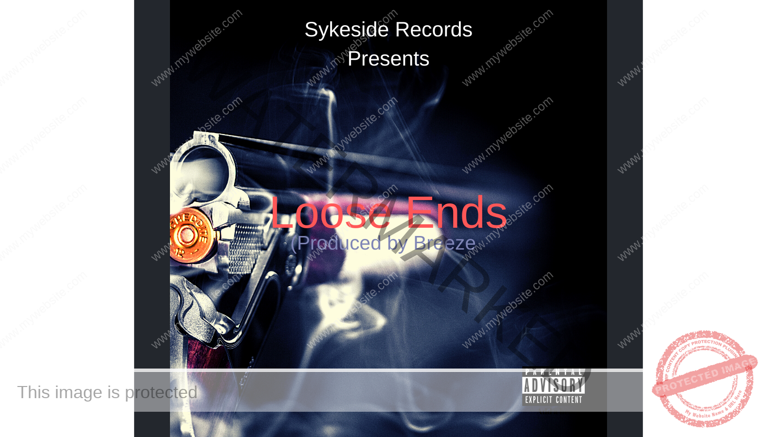
Part 7 of 31 “Loose Ends” Single Series: Pre – Artwork Creation
A Picture is worth a thousand words
A picture is worth a thousand words is the idea that with just a single picture, the viewer can find deeper meaning within it. A picture or album cover can make you have an idea of a song and click to listen.
How does a picture actually make someone interested in knowing what the content inside portrays? Sykeside Records is going to give great examples of how we get this done.
The Artwork comes from the music
Have you ever seen a commercial that has nothing to do with the product and you’re like what the hell? Is that a bad thing is really what the question is?
If what the company is going for, in order to have the consumer say to someone “Did you see this commercial?”. That is not a bad approach but that’s not what we at Sykeside Records do for Breeze.
We ask him what he thinks would be the best way to determine how to create the artwork of his songs. Once we listen to the song idea and understand the direction then this process becomes easier to do.
How do we make the Artwork match the music will give you a great perspective on the process that’s actually done. Sykeside Records makes sure to match the song with the artwork so there is no surprise.
-
 Red Vision Snapback Hat$45.00
The first task at hand is colors
How would you consider what colors to choose for your notebook or for your car? The decision that you make for those things are based on your feelings.
You would see a row of note the same notebooks and choose the color blue because that is the color you’d like to see every day because it identifies with your personality. This concept is sort of what we do for the color for the artwork but it works like this.
30% off a Masterpiece on breezebeats by using this code Blog30percent
We ask Breeze when you hear the song what colors come to mind? We take that into consideration and also think of the time of year we are in and the subject matter of the song.
Writing down things like Spring, waves, love, pain, and heartbreak would have more than enough information to begin to create the artwork. When those words are read the colors would go something like Spring = Green, Waves = Blue, Love = Red, Pain = Red or a light blue or purple.
The Lyrics
The lyrics can serve the purpose of what items to help identify the artwork cover. If the song is about war or love you would put a heart or gun to try and identify to someone what the song is about.
If the song is about horses, we would put a horse on the cover and add an interesting item to make the viewer think “why does this artist have a horse as a cover?”
Leave a Reply
You must be logged in to post a comment.